Boosting Development and Design Efficiency with Reusable Components - A Case Study
In this case study, I'll showcase how we design reusable components that are now used in many of
Jio's enterprise products.


How Reusable Components Helping Developers and Designers ?
In our team at Reliance Jio , there are multiple internal products is in progress and in those products there are many components which are common. Therefore, we designed these components to facilitate other designers and developers. This empowers designers to simply drag and drop these elements into their projects, modifying them as needed.
Developers also benefit by leveraging the pre-written code for these components, eliminating the need to start from scratch (especially for front-end development). By creating this library, we've significantly reduced design and development time and effort.
Below, I am sharing five of the components we have designed and explaining their anatomy and where they are used in different Jio products.
1.
Side Navigation
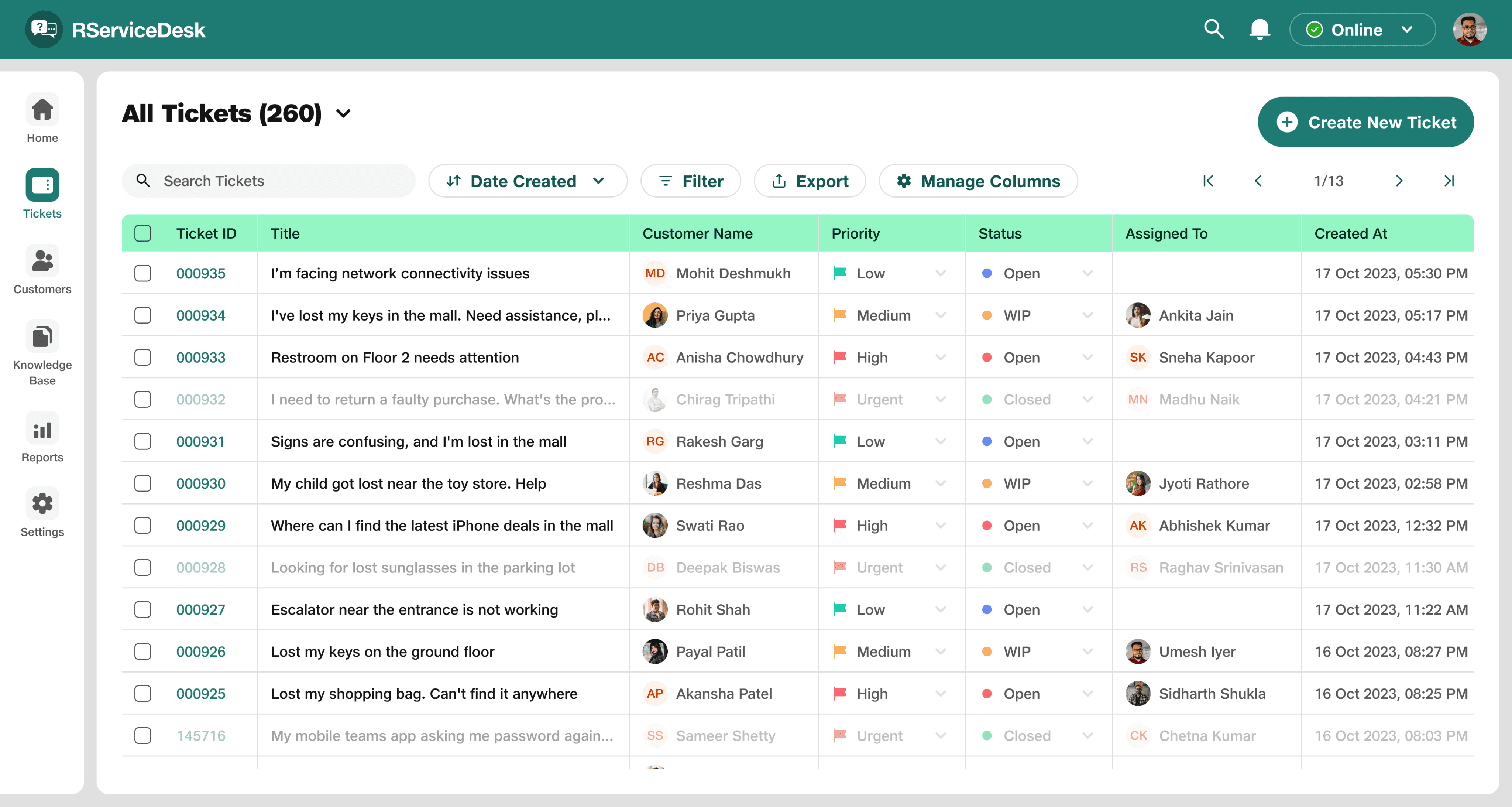
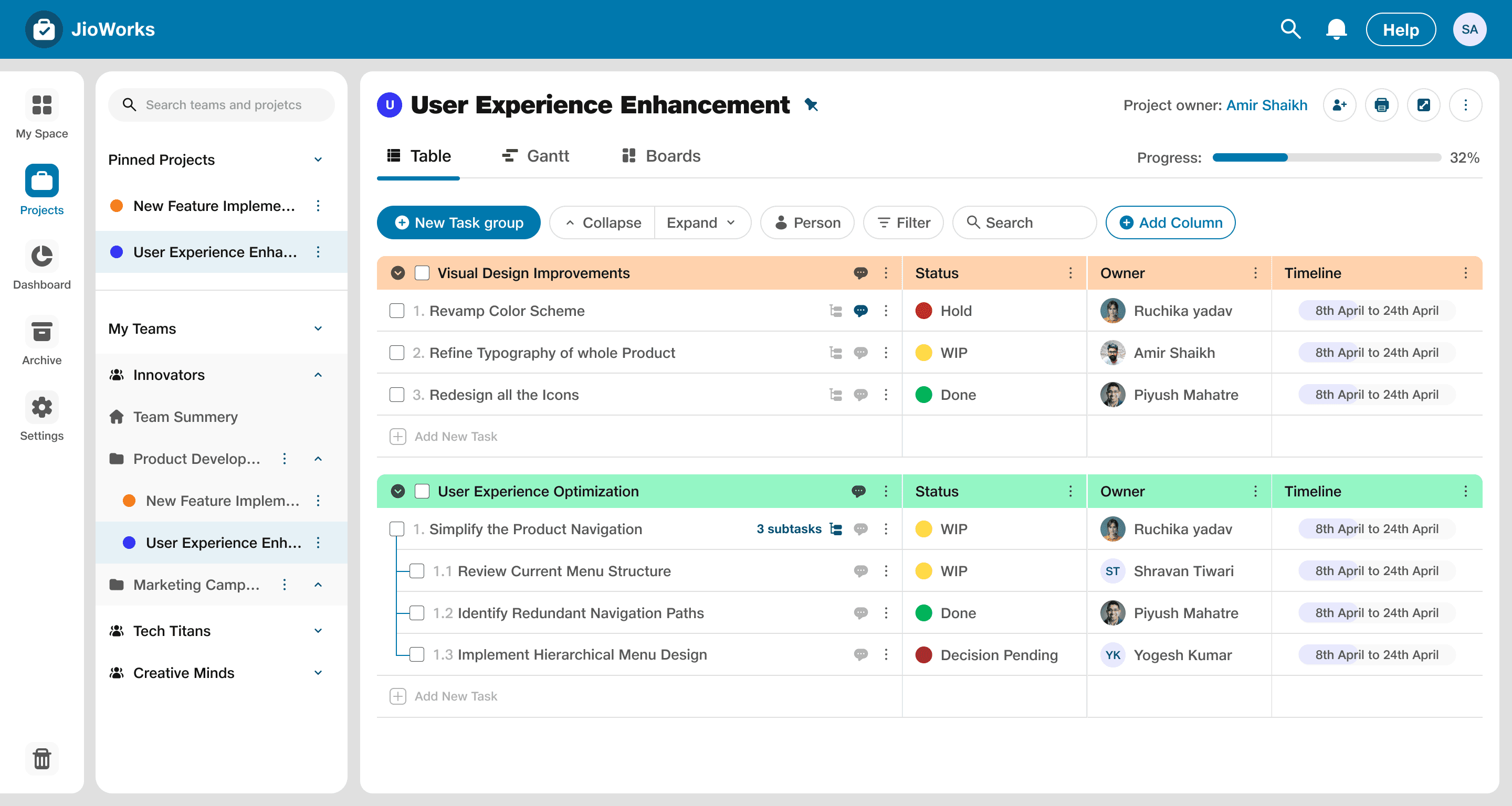
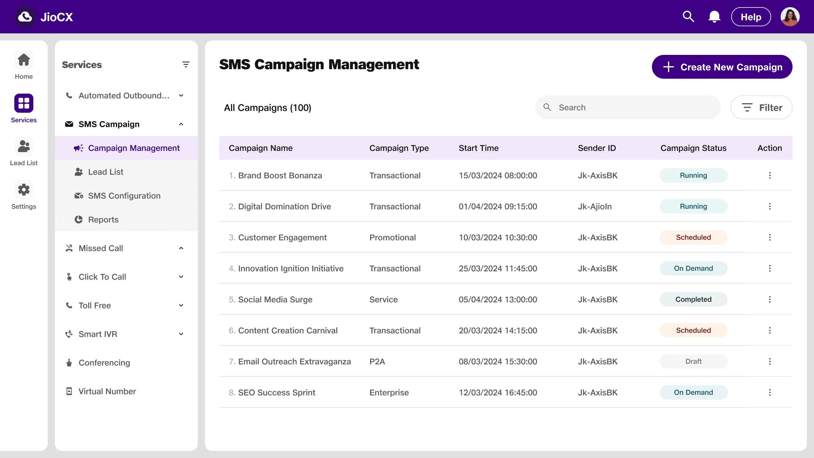
Side navigation (tabs) allows users to navigate a product's entire content or a section. This is the most important component as it used in mostly every Jio’s enterprise product.
Title
Title
Overview
Contacts
Campaigns
Automation
Knowledge
base
Settings
Overview
Contacts
Campaigns
Automation
Segments
Settings
Title
Component and Anatomy
Side Navigation Use-case in Different Jio’s Products
Component: Side Navigation
Anatomy:
Title
Title
Title
Default
Active
32*32px bounding box
24*24px icon
8px corner radius
Tab name
RServiceDesk: Ticketing and Customer Support Platform
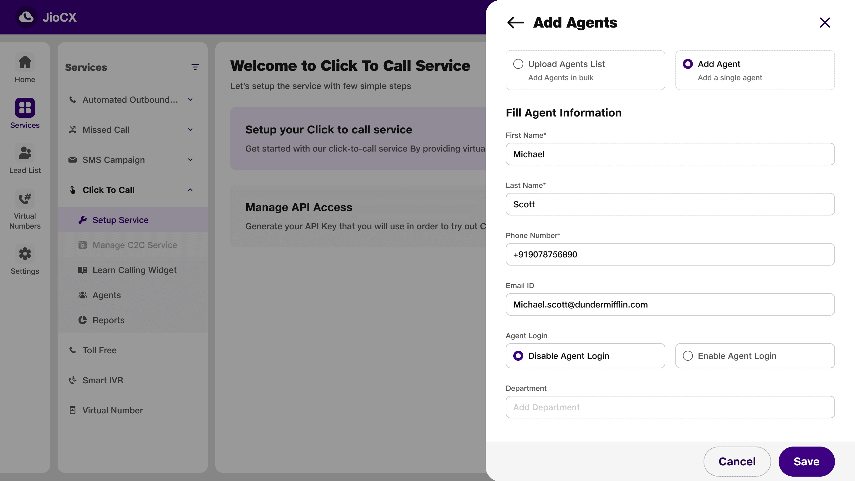
JioWorks: Team and Project Management Platform
JioCX: Multi Channel Communication Platform
Side
Navigation
2.
Top Navigation Bar
The top navigation bar is the menu you see at the top of the screen. It gives you quick access to important features like user profile, notifications, search function, and sometimes even the ability to switch between different accounts (tenant switching). The specific options might vary depending on what the product needs.
Component and Anatomy
Top Navigation Bar Use-case in Different Jio’s Products
RServiceDesk

RServiceDesk
Jio World Drive

RServiceDesk
Jio World Drive

Components: Top Navigation Bar
Anatomy:
Product Logo
Profile
56px
Tenant name
(if any)
Change tenant name
Customisable icons
32px


Top
Navigation
Bar
3.
Toolkit
The Toolkit empowers to manage bulk actions in the table. It displays the number of selected rows and provides a menu of actions applicable to selection items.
Component and Anatomy
Components: Toolkit
Anatomy:
22
Items Selected
Action
Action
Action
Action
Action
Action
Action
Action
Action
Action
Default
Hover
Disabled
bounding box
24*24px icon
8px corner radius
Action name
Action
Action
Action
22
Items Selected
Action
Action
Action
Action
Action
Action
Selected items count
Closing toolkit
Action items
64px
Toolkit Use-case in Different Jio’s Products
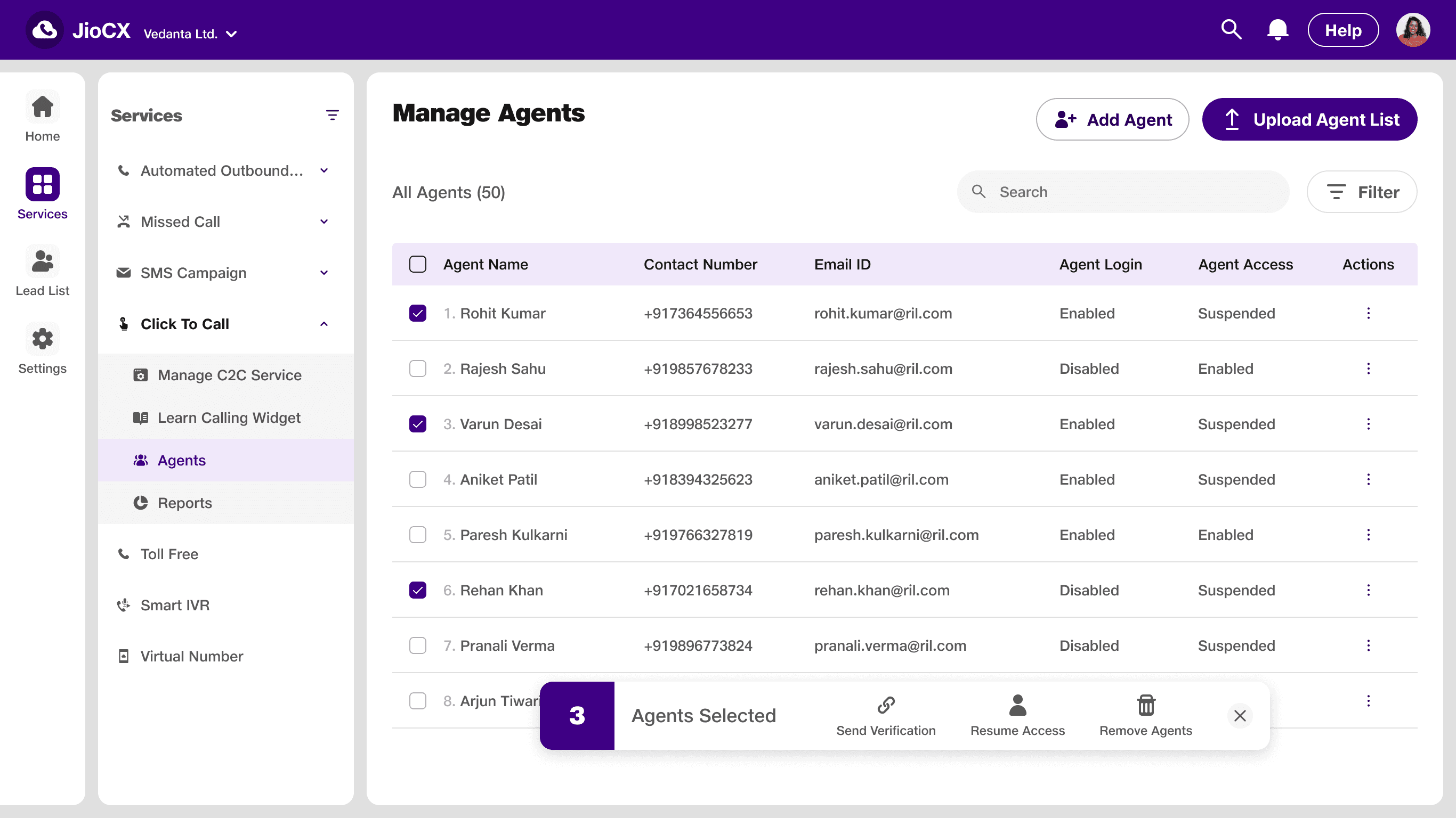
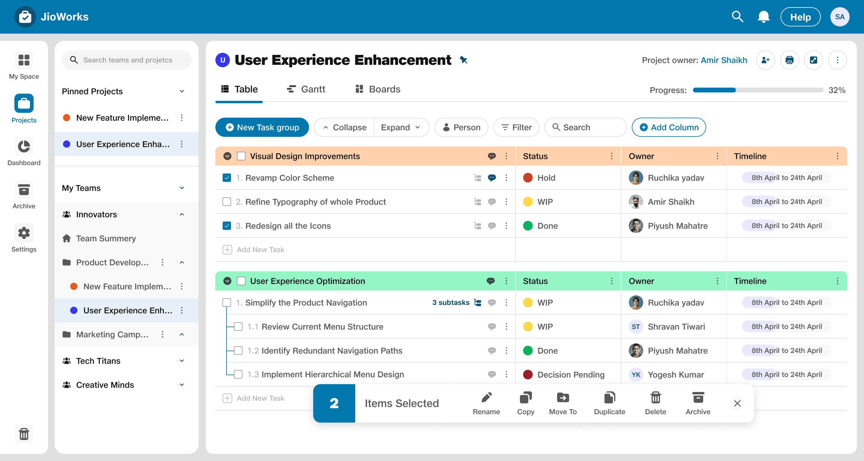


Toolkit
4.
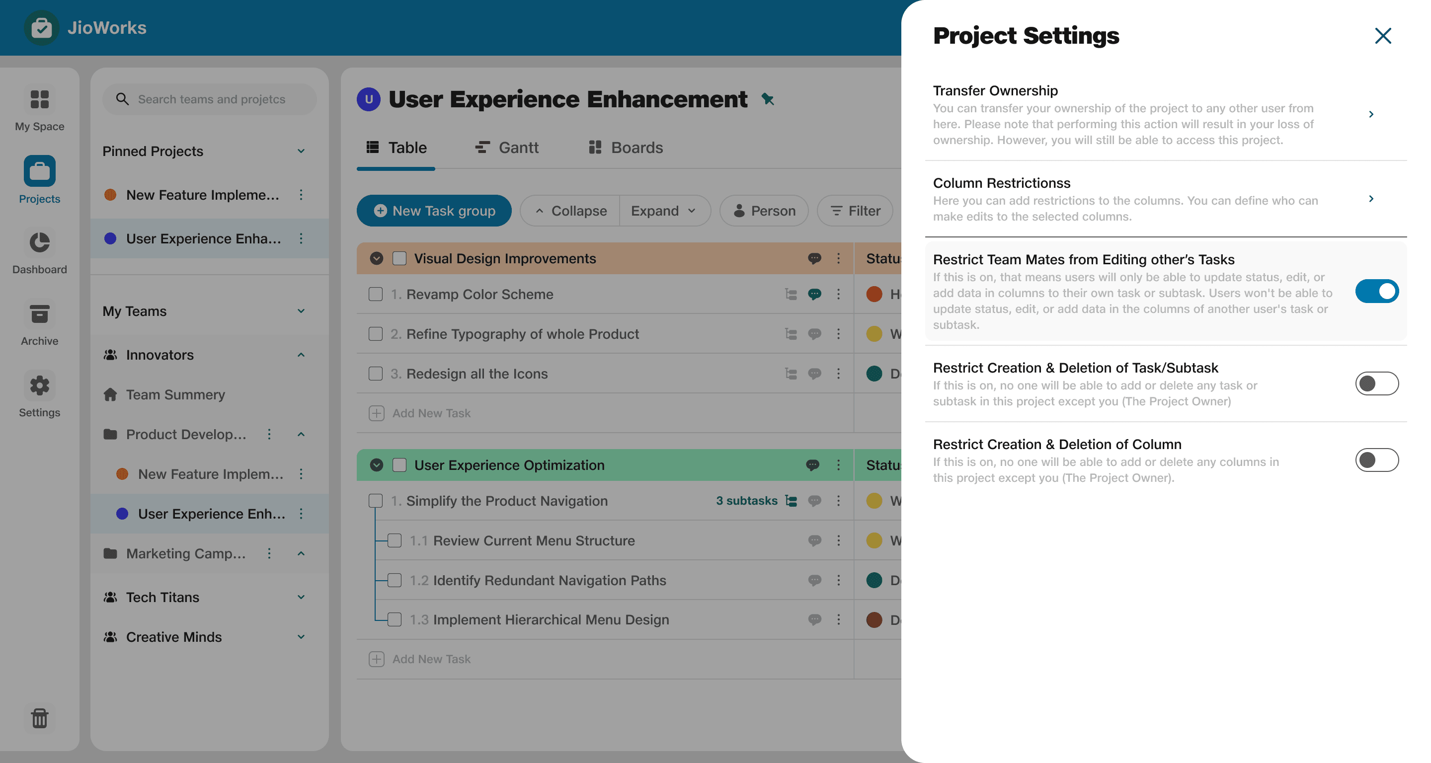
Side Sheet/Panel
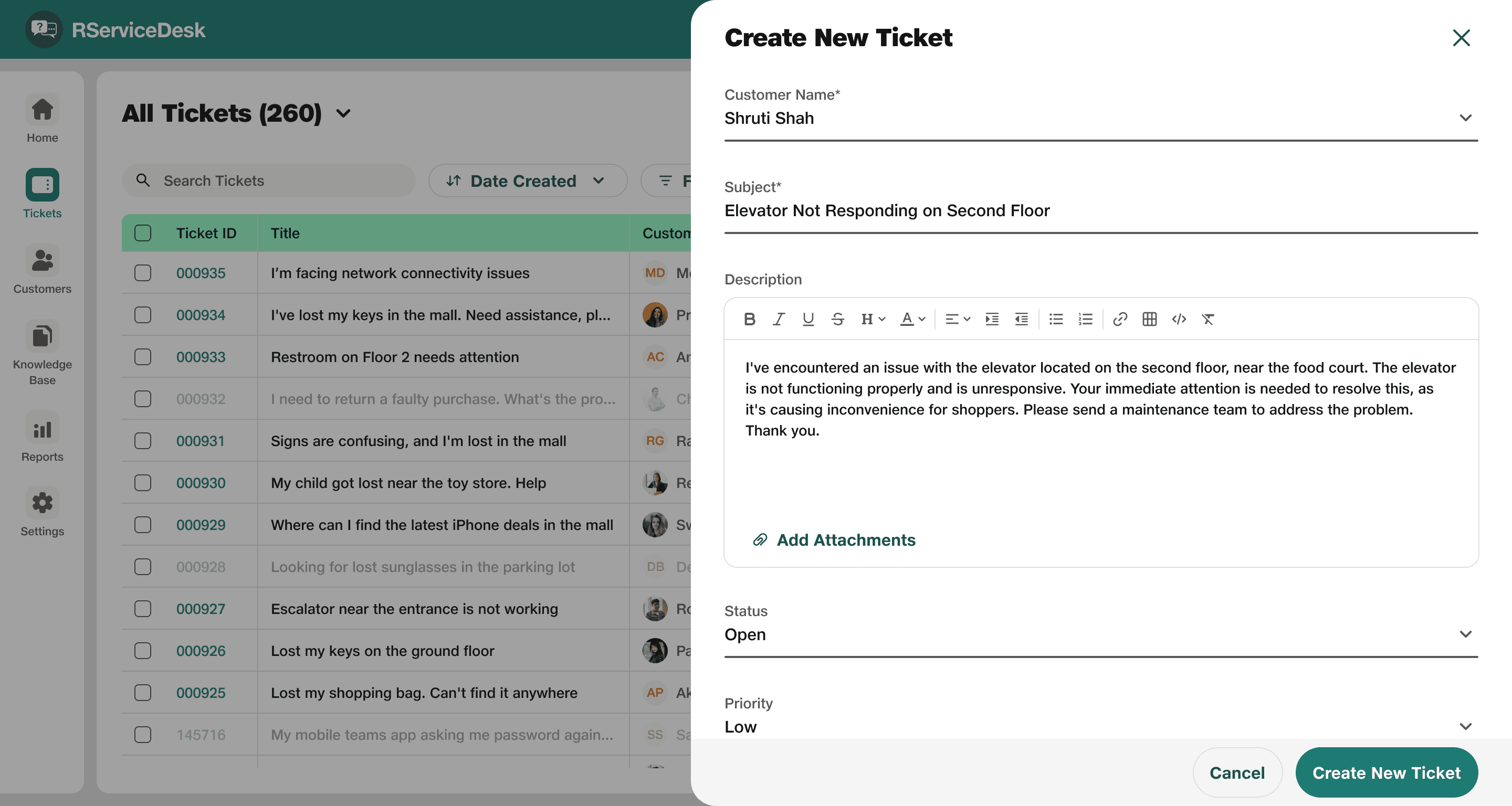
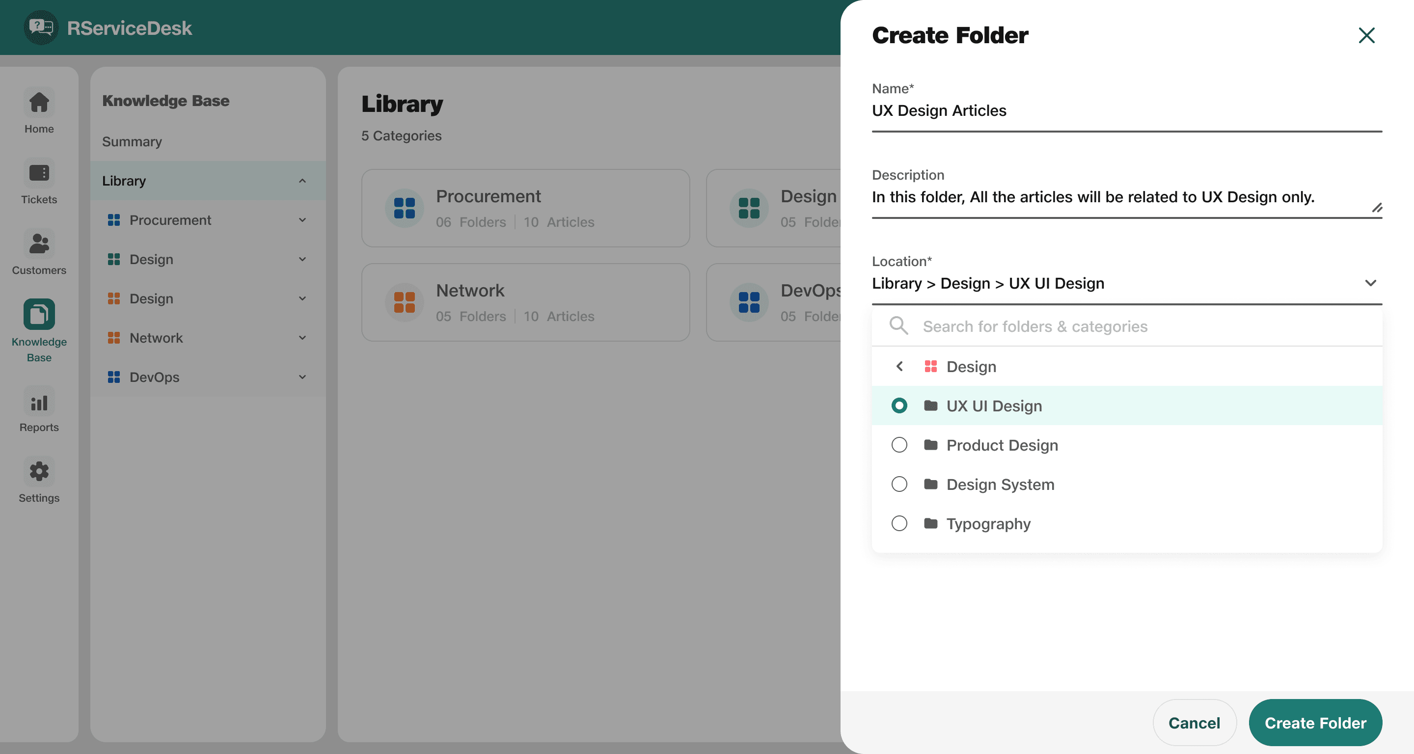
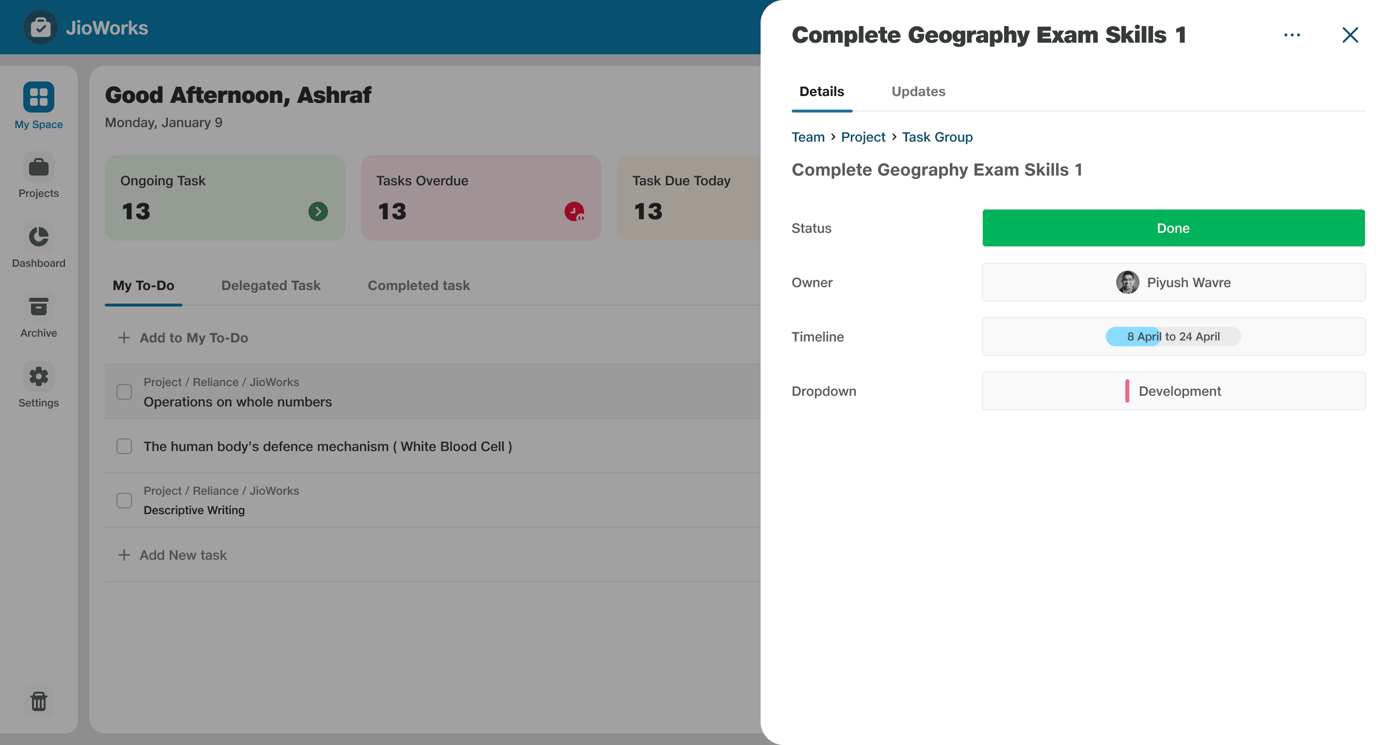
A side sheet/panel in a product is like a temporary window that slides out from the side of the screen. It provides additional information or options without completely taking you away from the main content.
Component and Anatomy
Cancel
Primary action
Extra Action
Cancel
Primary action
Side Sheet Header
Cancel
Primary action
Side Sheet Header
Extra Action
Cancel
Primary action
Side Sheet Header
Side Sheet Header
Cancel
Primary action
Side Sheet Header
Extra Action
Cancel
Primary action
Side Sheet Header
Side Sheet Header
Cancel
Primary action
Side Sheet Header
Extra Action
Cancel
Primary action
Side Sheet Header
Side Sheet Header
Cancel
Primary action
Side Sheet Header
Extra Action
Cancel
Primary action
Side Sheet Header
Anatomy:
Side Sheet Header
Side Sheet Header
Button
Side Sheet Header
Side Sheet Header
Button
Side Sheet Header
Side Sheet Header
Button
Side Sheet Header
Side Sheet Header
Button
Components - Header of Side Sheet/Panel
Components - Footer of Side Sheet/Panel
Components - Side Sheet/Panel
Side Sheet Header
Button 3
Button 2
Button 1
Side sheet header
Footer of side sheet/panel
Customizable
icon - 32px
Tertiary Action
Side sheet header
Side sheet footer
Closing icon - 32px
Primary action
Secondary Action
72px
64px
Custom width as per requirement
Side Sheet Header
Extra Action
Cancel
Primary action
Content will be here
Side sheet header
Side sheet footer
Side sheet
Side
Sheet/Panel
Side Sheet/Panel Use-case in Different Jio’s Products
5.
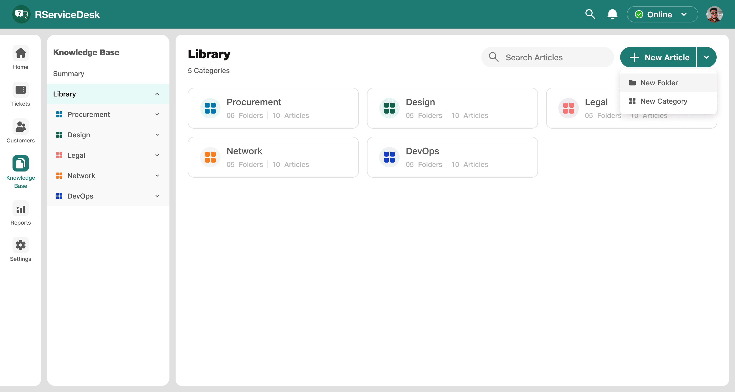
Split Button
A split button combines a primary action with a menu of related options. Click the main button for the most common action, or use the dropdown for more specific choices.
Component and Anatomy
Split Button
Split Button
Split Button
Split Button
Split Button
Split Button
Split Button
Components - Split Button
Action text
Button divider
Action icon
Dropdown
Anatomy:
Split Button Use-case

Split Button
Potential Impact 💪
Consistent Design: By using these components we achieved consistent design across all the products.
Reduced Cognitive Load: By using familiar components, our users don't have to relearn how to interact with
those element.
Increased Efficiency: These components increased the efficiency of designers and developers.
And… That’s a wrap!
I hope you guys found this case study useful and informative.
Feel free to connect with me on LinkedIn if you have any questions or feedback! Thank you! ✌